


JL Recharge
Telecom
Saas
JL Recharge: Reimagining Digital Recharge Experiences
A design-led transformation aimed at reducing friction in everyday transactions while building a system ready to scale.
Duration
12 Months
Industry
Telecom
Impact
200% Increased
Location
USA
About JL Recharge
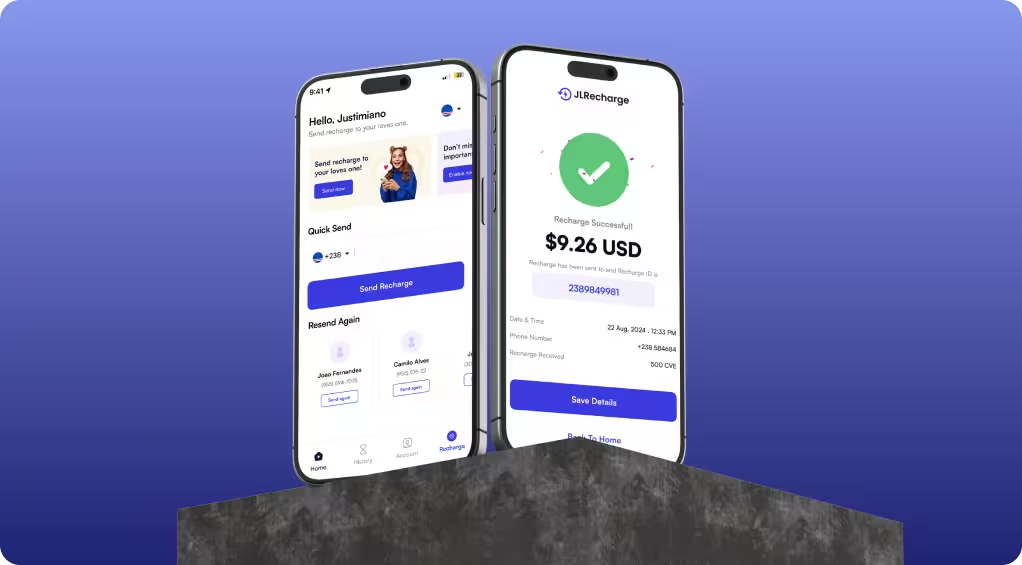
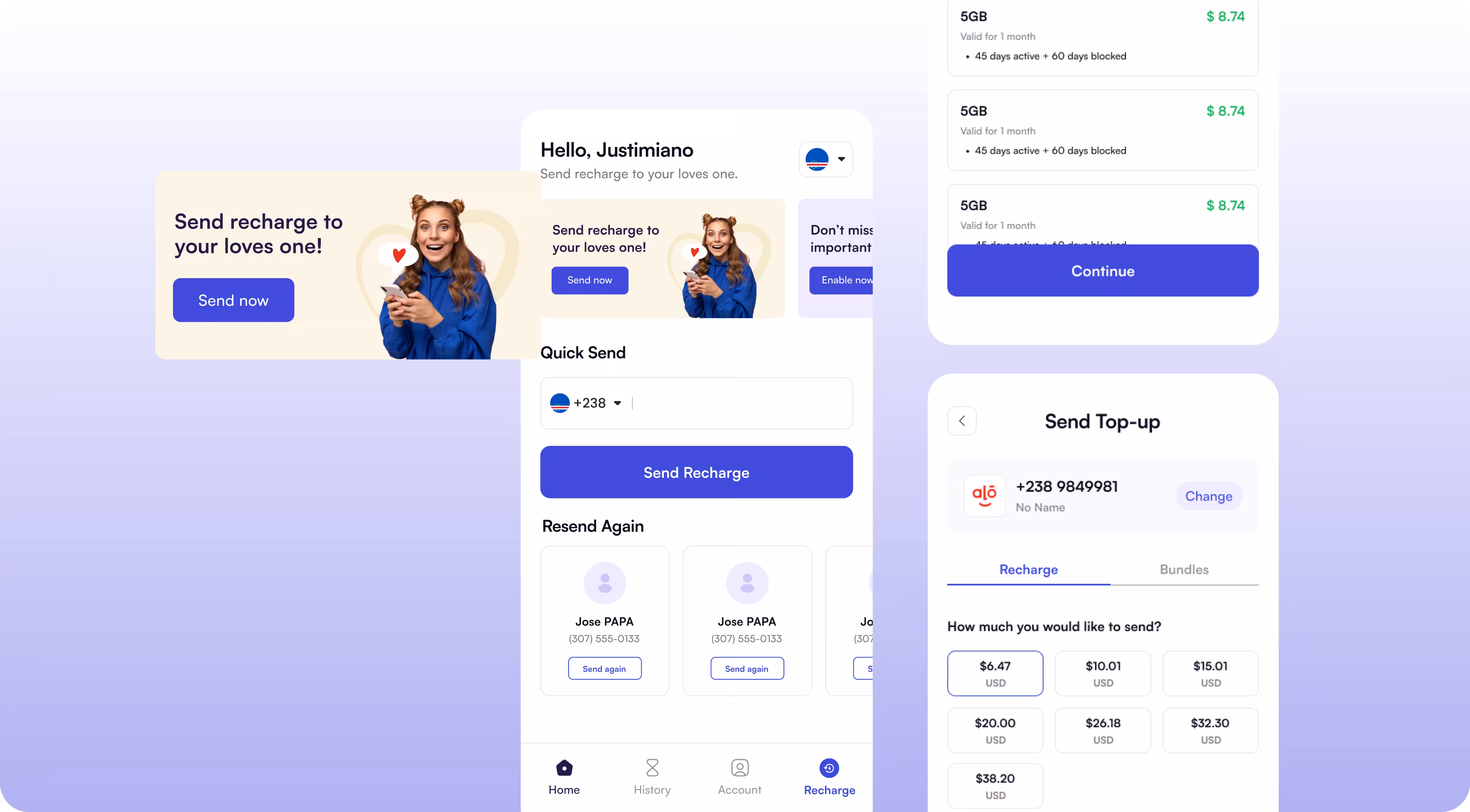
JL Recharge is a mobile top-up platform serving users in Cape Verde, offering seamless recharge services through both web and mobile applications. The platform enables users to manage recharges, receivers, orders, and bundles within a single ecosystem. As the product scaled, the existing interface struggled to support usability, clarity, and consistency across platforms. Prodzyn was engaged to revamp the entire design system, elevate the user experience, and modernize the interface without altering the core functionality.

Client Story
JL Recharge approached Prodzyn with a clear objective: improve the usability and visual appeal of their existing product while maintaining operational continuity. The client needed a design partner who could rethink the entire experience, simplify complex workflows, and deliver a future-ready interface aligned with their growing user base.
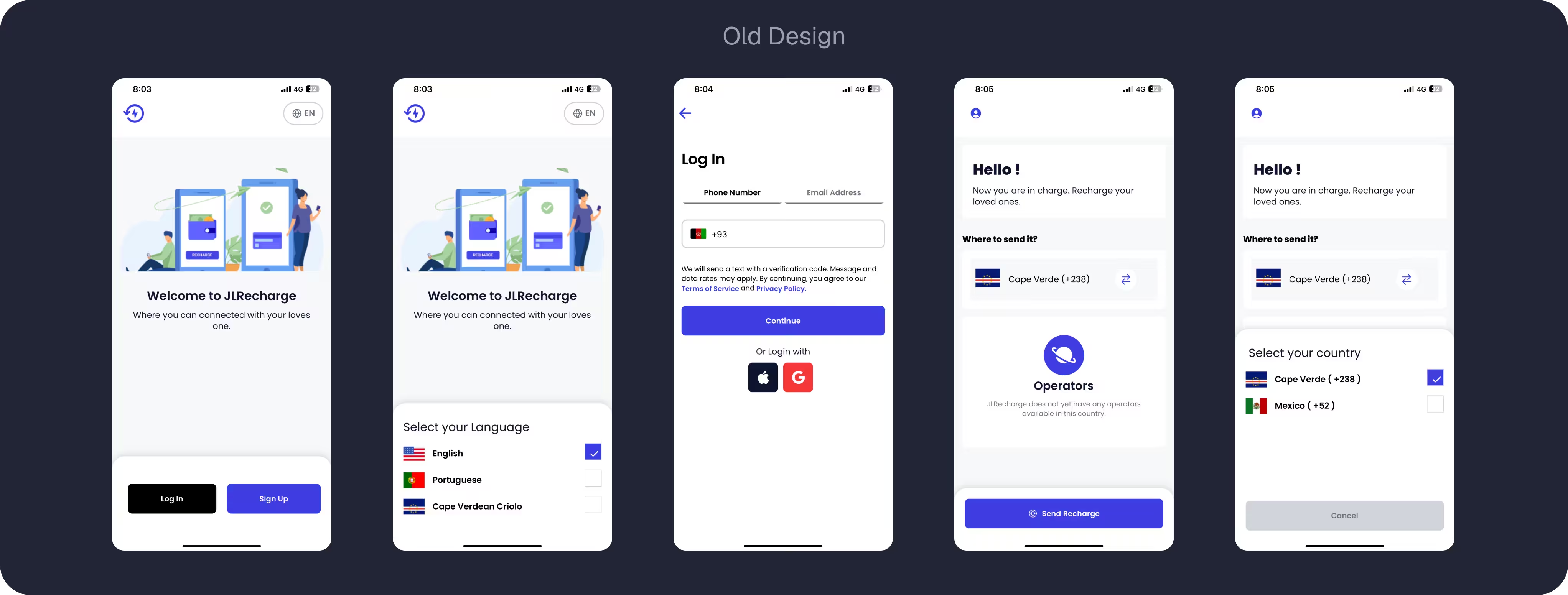
The Challenge
As JL Recharge expanded its services and user base, the existing interface began to show usability and experience gaps. While the platform was functionally sound, the design no longer supported intuitive navigation, clear decision-making, or consistent interaction across web and mobile, creating friction in critical user journeys.
Fragmented User Flows
ritical actions like recharge, receiver management, and order review required multiple steps with unclear progression.
Inconsistent UI Across Web & Mobile
Design patterns, spacing, and components lacked consistency, impacting usability and brand perception.
Cognitive Overload on Dashboards
Dense layouts made it difficult for users to quickly understand balances, orders, and system messages.

Undefined Product Scope:
No clear feature list, user flow, or product boundary, only a broad vision to digitize healthcare records.
No clear feature list, user flow, or product boundary, only a broad vision to digitize healthcare records.

Complex healthcare data:
Patient information spans multiple categories and sensitivities, making organization difficult.
Patient information spans multiple categories and sensitivities, making organization difficult.

Enterprise Scalability Requirements:
The product needed to work for individual practitioners while also supporting multi-doctor facilities and future expansion.
The product needed to work for individual practitioners while also supporting multi-doctor facilities and future expansion.
The Solution
Prodzyn delivered a complete design revamp, focusing on clarity, usability, and consistency. We restructured key user journeys, introduced a cohesive visual system, and optimized interactions across both web and mobile platforms. The result was a cleaner, more intuitive experience that reduced friction, improved task completion, and positioned JL Recharge for long-term scalability.


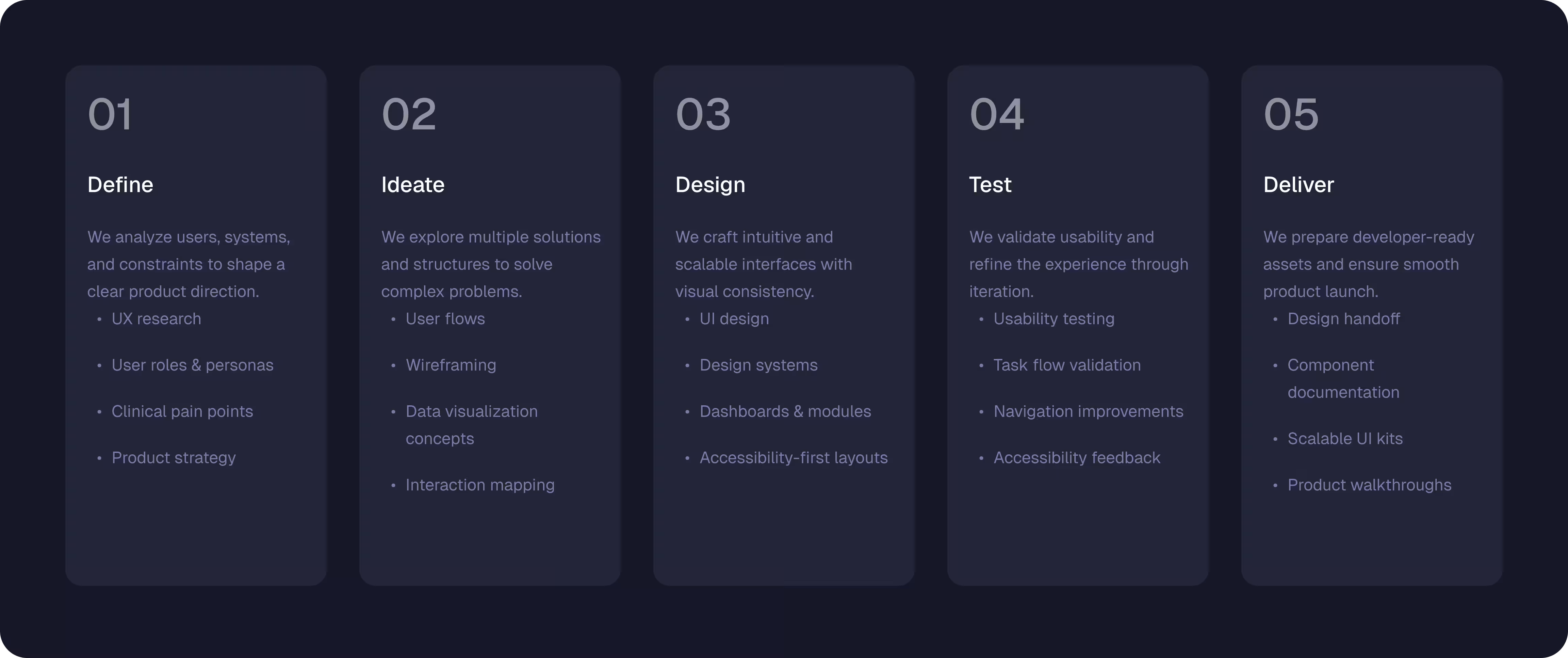
Design Process
The design process for JL Recharge was a comprehensive, insight-led engagement focused on transforming an existing, functional product into a refined and scalable digital experience. Rather than applying surface-level visual changes, we approached the revamp by deeply analyzing user behavior, system limitations, and business objectives. Each phase of the process was structured to eliminate friction in high-frequency actions, improve clarity across complex transaction flows, and establish consistency between web and mobile platforms.
Define
- Mapped user roles and personas
- Identified primary pain points in clinical workflows
- Audited existing record systems for gaps
- Prioritized features based on impact and feasibility
- Established compliance and privacy requirements
- Defined product scope and MVP features
Ideate

- Created multiple user flow options
- Sketched wireframes for all core screens
- Brainstormed solutions for complex data visualization
- Mapped interactions for both patients and doctors
- Explored scenarios for emergency and routine use
- Collaborated with the client for early validation
Design
- Developed high-fidelity screens with clarity-first layouts
- Structured modular patient profiles for easy navigation
- Applied consistent typography, color, and iconography
- Designed scalable doctor & facility management modules
- Created dashboards with actionable insights at a glance
- Built accessible and intuitive interactions
Test
- Conducted usability tests with mock users
- Observed task completion times and bottlenecks
- Iterated on navigation and information hierarchy
- Validated real-world clinical use cases
- Collected feedback for accessibility improvements
- Ensured error prevention in critical workflows
Deliver
- Produced a complete design system with reusable components
- Documented interactions, styles, and patterns for developers
- Delivered pixel-perfect screens ready for implementation
- Ensured scalability for multi-facility operations
- Handoff included guidelines for future feature expansion
- Supported client onboarding with product walkthroughs
Define
- Mapped the complete trademark registration lifecycle, from user intent to USPTO submission
- Identified critical failure points leading to rejections and delays
- Defined primary user groups including individuals, businesses, and repeat filers
- Established functional requirements based on legal compliance needs
- Clarified consultant involvement touchpoints within the digital flow
- Set success metrics around accuracy, completion rate, and reduced friction
Ideate
- Translated legal workflows into step-by-step digital journeys
- Structured information architecture to match user mental models
- Designed guided form logic to prevent incorrect inputs early
- Planned progressive disclosure to avoid overwhelming users
- Explored validation and review checkpoints for consultant oversight
- Aligned ideation with scalability and future feature expansion
Design
- Designed clean, structured interfaces focused on clarity and trust
- Created form-heavy layouts optimized for long data entry sessions
- Developed visual hierarchy to guide users through complex steps
- Built reusable UI components for consistency and speed
- Designed feedback states for errors, success, and progress tracking
- Ensured accessibility and readability across devices
Test
- Validated user flows for first-time and repeat applicants
- Tested edge cases related to incorrect classifications and documents
- Reviewed form logic to ensure data completeness before submission
- Iterated on copy and micro-interactions to reduce confusion
- Conducted internal usability reviews with real filing scenarios
- Refined flows based on consultant feedback and operational needs
Deliver
- Delivered a production-ready, scalable trademark filing platform
- Ensured seamless handoff between user submission and consultant review
- Optimized performance for real-time uploads and form handling
- Implemented a workflow that minimizes rejection risks
- Aligned final build with USPTO process requirements
- Launched a system designed for long-term operational efficiency
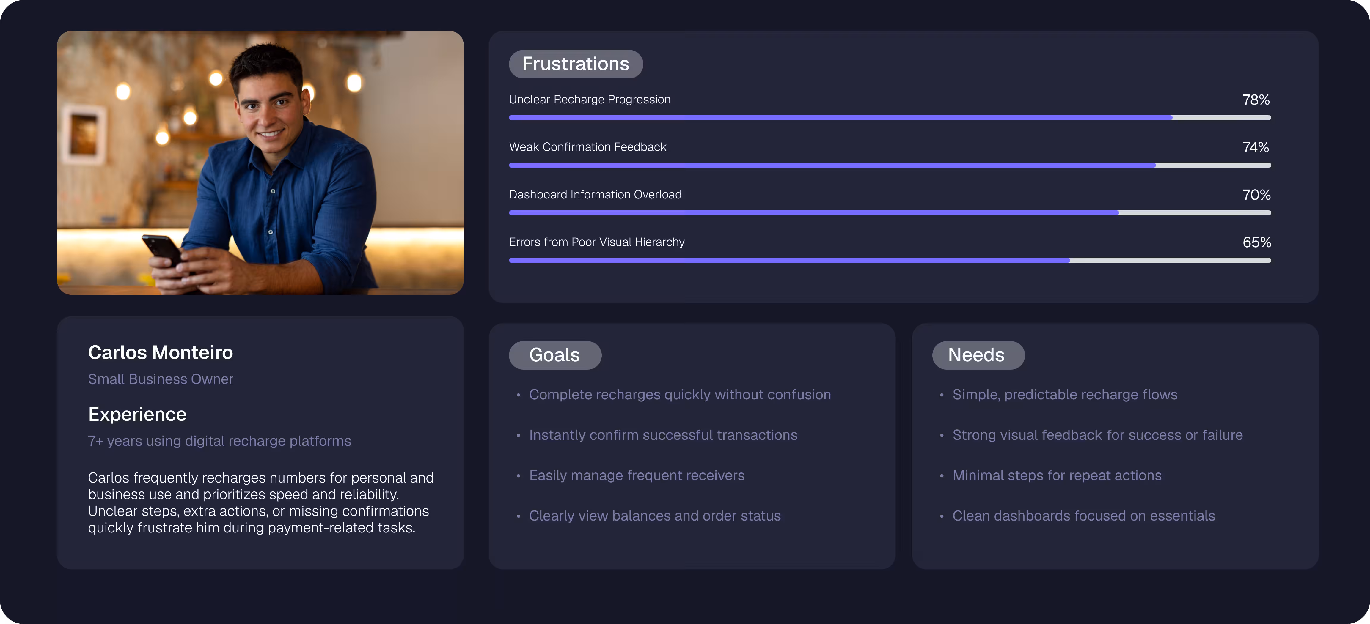
UX Research
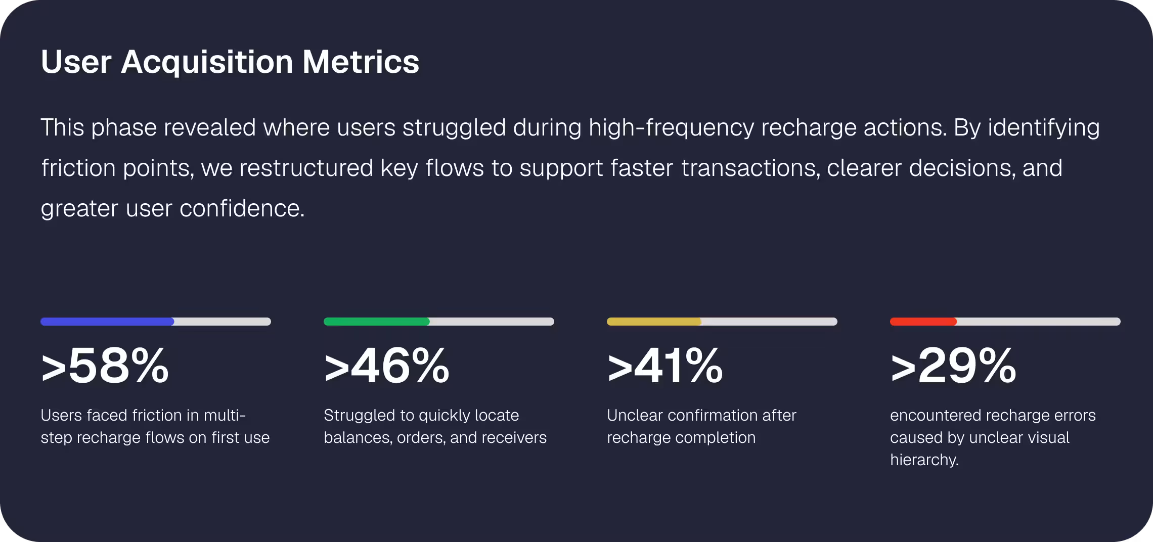
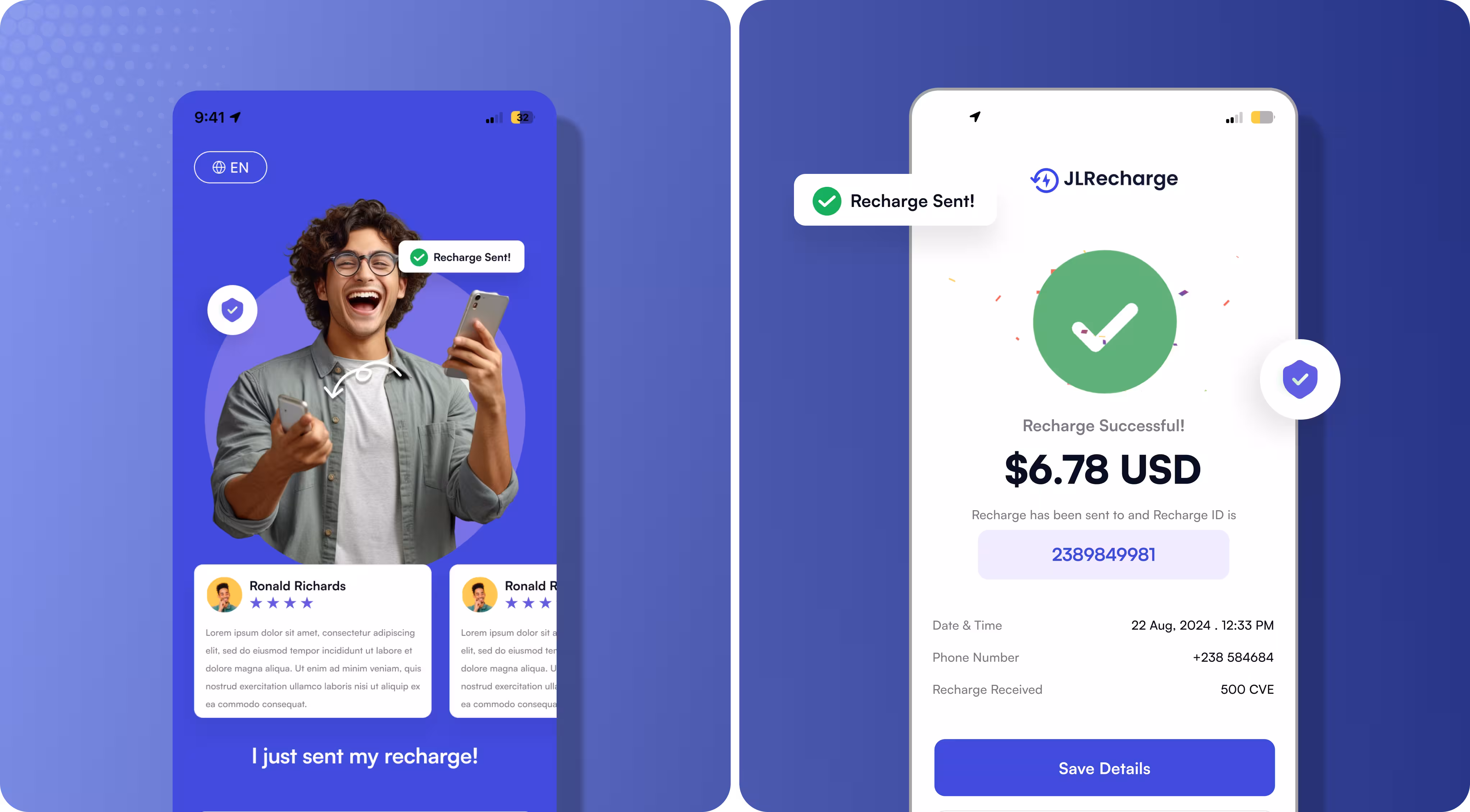
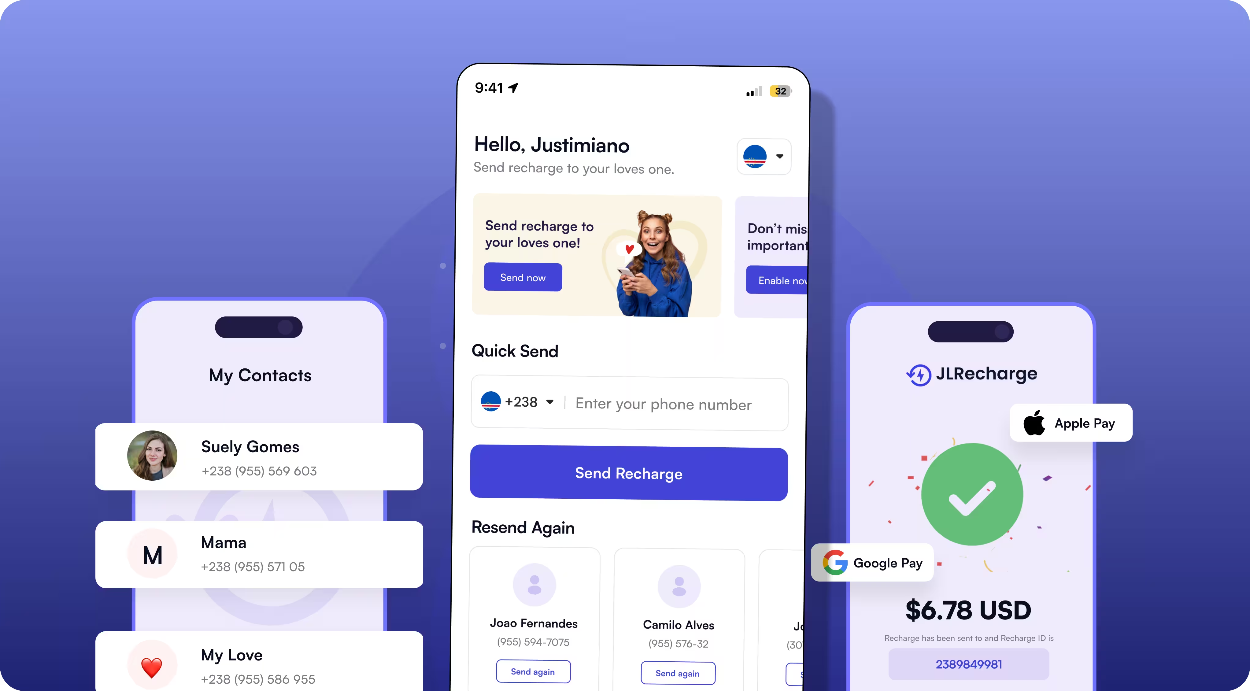
UX research focused on evaluating existing user flows to identify friction points across high-frequency actions such as recharges, receiver management, and order reviews. Through heuristic analysis and journey mapping, we uncovered issues related to navigation clarity, visual hierarchy, and flow continuity. These insights guided design decisions to simplify interactions, prioritize key actions, and create a more intuitive experience across both web and mobile platforms.
Style Guide & Components
A cohesive style guide and component system were developed to ensure visual consistency and scalability across the platform. This included standardized typography, color usage, spacing rules, and reusable UI components, enabling faster design iterations, consistent user interactions, and seamless alignment between web and mobile experiences.

Let’s work together!
Bring your idea to life with design, strategy, and no-code innovation.
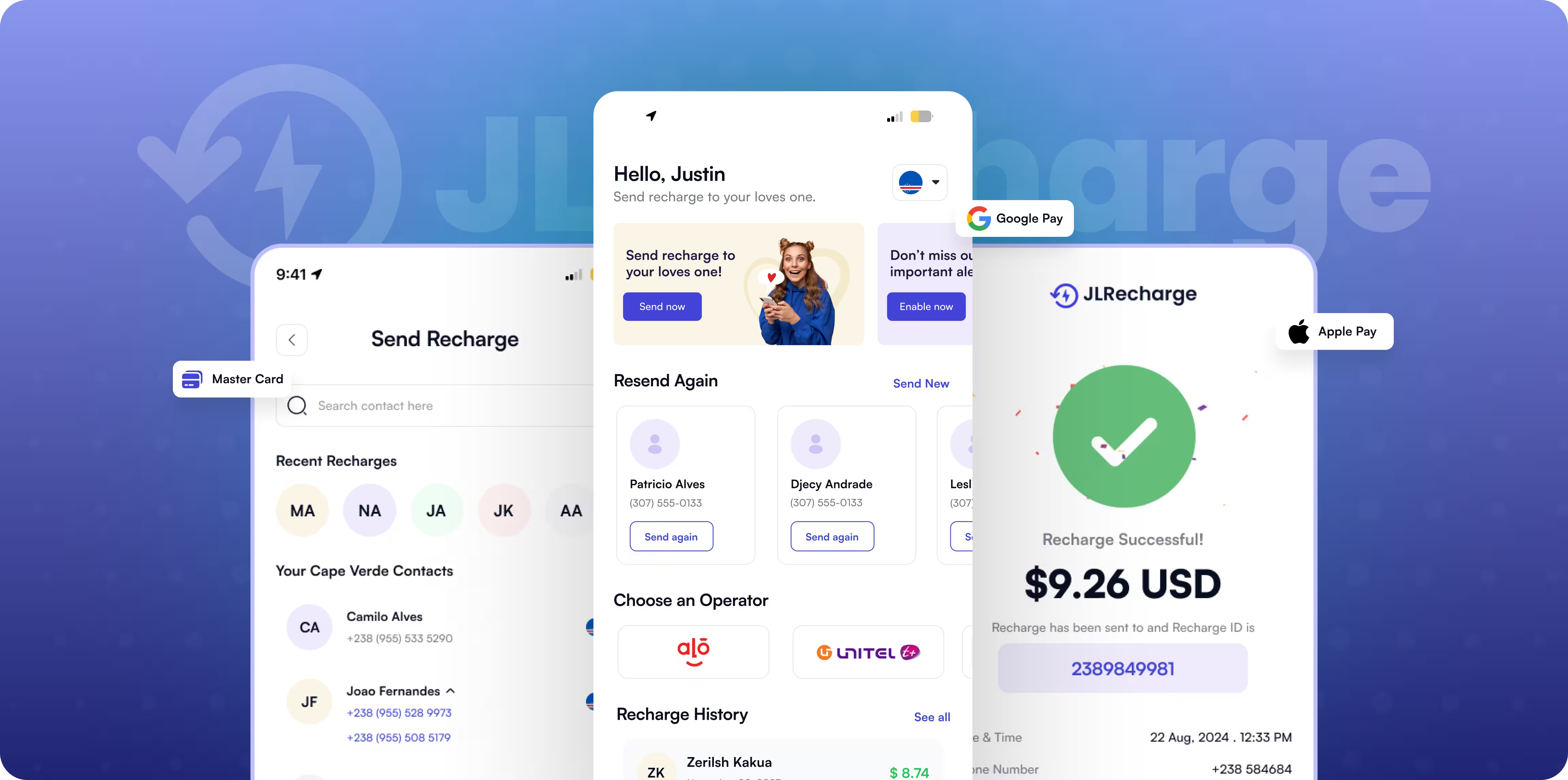
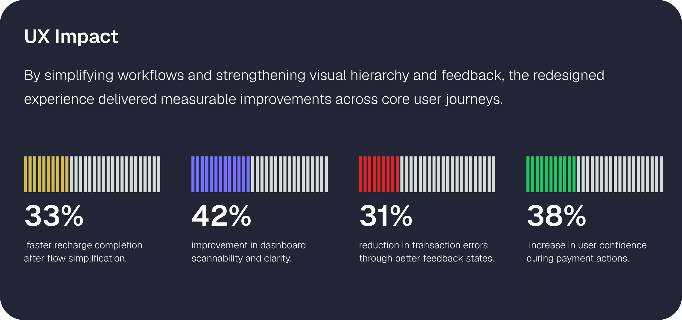
Final Design
The JL Recharge revamp resulted in tangible improvements across core user journeys, particularly in high-frequency actions such as mobile recharges, receiver management, and order review. By restructuring flows and introducing a clearer hierarchy, the platform shifted from a dense, utility-driven interface to an experience optimized for speed, clarity, and repeat usage.
Duration
1 month
Industry
Healthcare/Wellness
Impact
400% Increased Conversion
Impact
United States
Duration
1 month
Industry
Healthcare/Wellness
Impact
400% Increased Conversion
Impact
United States
The Results
- 25 - 35% faster recharge completion through streamlined flows and clearer actions
- Improved dashboard scannability with structured layouts and reduced visual clutter
- Lower transaction errors due to clearer hierarchy and confirmation states
- Consistent web and mobile experience powered by a unified component system
- Scalable design foundation enabling faster future feature rollouts

Have a Project like this?
Turn your vision into a digital product that engages, converts, and scales.


Oops! Something went wrong while submitting the form.